Mobile web design was the norm for a really long time but this is definitely about to change and the trend is changing really fast. Mobile web design was definitely advantageous when it first appeared since it offered a much better display for the smartphone user. This technology can be considered as being one of the starting points of upgrading in a progressive manner, going beyond the limitations that are connected to the desktop PC. The huge problem is that a company basically needed 2 different designs and 2 different websites. One was meant to display mobile page content and the other one was suitable for the PC user.

Mobile web design was preferred by many because of various reasons. Experts basically started from the idea that the web application had to first be designed for use on mobile devices. Smartphones were beginning to gain popularity and the truth is that this was basically the only option that was known at that point in time. A new platform that was favouring millions of users meant that companies were able to promote products or services to the following computing consumer generation.
Mobile design was fostering a much cleaner concept that did not include extraneous elements or page clutter that was not necessary. The mobile phone has a much smaller screen size so we do not have all the needed room to add those extra widgets and buttons we are used to when using a full monitor. The design team remains focused on what is actually necessary. The user is offered one clear route that points towards exactly what they want. Because of this, it was assumed that you would be faced with a much better experience.
Nowadays, responsive web design is preferred by professional Sydney web designers because of the fact that there is a possibility to incorporate a lot more than with the regular mobile design. The application was basically perfect for smaller mobile phones when mobile web design was used but now, the modern smartphones are similar to a regular computer. Because of this, there is so much more that can be done with responsive web design.
Responsive web design basically adapts the content that is present to the size of the screen where it is displayed. This practically means that absolutely all the content that is present on the desktop will also be visible on a mobile device. Such a thing is practically impossible when looking at the mobile versions since they will lack a lot from the desktop version.
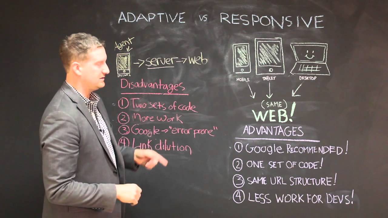
We should also mention the fact that it is really easy to have SEO problems because of the fact that it is a necessity to basically optimize 2 websites instead of just one. Responsive web design can aid you a lot to save cash as just one campaign can be used to increase rankings. Even social media campaigns will work better when you are using just one version of the site since you do not need to do too much optimizing in order to be successful.